


Crypto Radar is a regular dive into the field of technical analysis combined with our view on the Macro and Micro environment. These updates will help paint a picture from a day traders perspective on the potential movements we are likely to see in the short to medium term. Note this is for demostrational purposes only and not financial advice!
Bitcoin
Following on from last weeks Technical Analysis snap shot we can see that bitcoin has now pushed up and crossed the $50k barrier (dotted line) and is pulling back slightly.

Top pink bar ($60k) is the resistance, bottom pink bar ($44k) is the support
This is the daily chart
Downward red funnel is the bear path that Bitcoin broke out of
The Wealth Gap View : Ideally from a Technical Analysis (TA) perspective we would like to see support and respect for Bitcoin in the $46-48k region. This should act as a strong support while consolidating the price in order to create and push a second bullish leg up (move to the upside) to $56k region. We will likely get confirmation of this move in the next week or so.
Bitcoin Top Model
The Bitcoin Top Model (green dotted lines) uses multiple models (blue/ orange/ purple) to project the top Bitcoin price. This is a living breathing model that is continuously updating.
Heading back over to the on chain metrics we can see that the model predicting the bitcoin potential topping position is also starting to shift up from last weeks print of $167k to today being $170k. We would expect this to continue to rise over the coming weeks and move to a peak potential into the $250-300k mark (Total Guestimations)
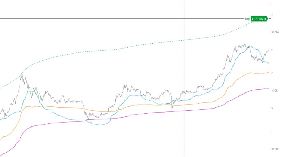
The models shown above explore alternatives to market price. The dotted line is a speculative future price projection based upon the solid lines. Solid lines carry metrics that come from the blockchain, that’s to say they carry fundamentals of investor, network and user behaviour.
If you have a spare 40 hours a week you can study the Technical Analysis behind these models here. Everything underlined is a link to an extended definition.
Grey Line - MARKET PRICE
The market price is determined by traders on the exchanges. This price is subject to manipulation and also emotional cycles of mania and fear.
Orange Line - REALISED PRICE by Coinmetrics.
This is the moving value of all coins in circulation, in other words an approximation of what the entire market paid for their coins.
Blue Line - NVT PRICE by Willy Woo
Think of NVT as a PE Ratio. This metric uses volume estimates from Coinmetrics Pro under license.
Purple Line - CVDD (experimental) by Willy Woo.
CVDD (Cumulative Value Days Destroyed) has historically picked the bottom of the market.
Nasdaq (Even more worry)
The Nasdaq is similar to the Dow Jones with a collection of major public equities being tracked via one combined index. The Nasdaq contains all of the companies that trade on the Nasdaq. Most are technology and internet-related, but there are financial, consumer, biotech, and industrial companies as well. The Nasdaq tracks more than 3,300 stocks.
Look at the path of growth on the chart below. It is quite amazing how rapidly the index has grown given we have just hit the worst pandemic globally since the Spanish Flu. We can clearly see the stimulation of the underlying market by the printing of money (Quantitative Easing) which then makes its way into the banking sector and into assets. The Reflation of the market from the March 2020 Crash up to break new all time highs and soaring as of today is one to be concerned with.

The Wealth Gap View : We like risk as an option for great opportunity especially when one can get exposure to a new asset class or little known industry or technology and then reap the rewards of getting in early. The issue we have with the above chart is that it encompasses the worlds largest tech giants. They are far from unknown and are likely showing signs of logical stagnation and an incumbent lack of innovation.
Question: How long can this chart continue to rise like this…?
Answer: It will stop rising once they stop printing money.
As or writing the USA alone is printing $120billion a month. When the music stops, the party is over! We are sounding the early warning fog horn but this environment can continue for months and even years if the appetite for printing money politically continues.
Till next time
The Wealth Gap Team